🎖 ARMR Modernization
Task Overview
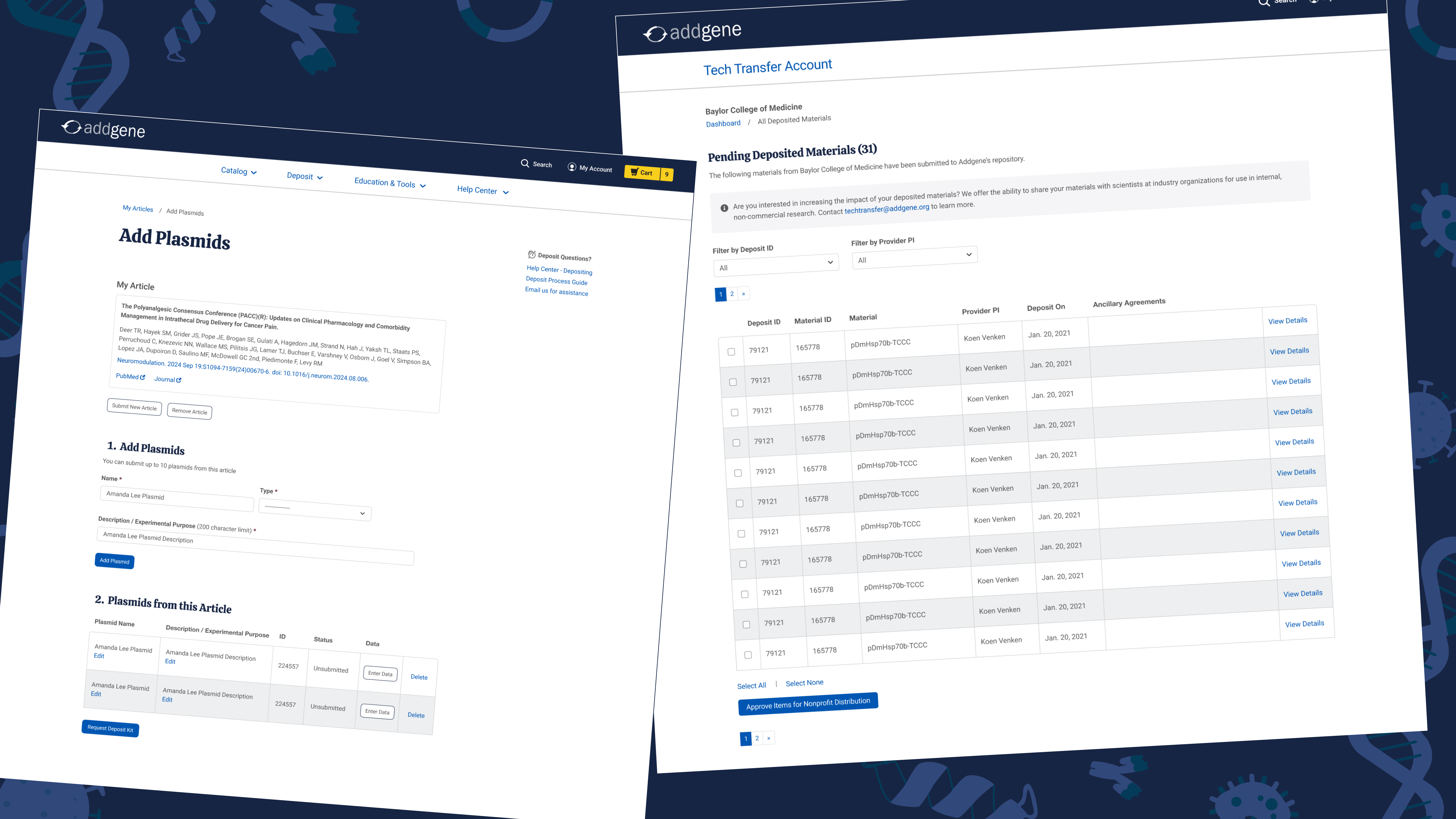
Modernize a NBCU legacy app, ARMR (Application to Readily Manage Royalties) by scoping out workflows, completely redesigning the front and backend, and using the enterprise design system.
Timeline
3 weeks (ongoing)
Product Value
✸ How NBCU gets paid
✸ ARMR does what other NBCU internal products cannot do such as title matching activity
✸ $1.7B revenue
Impact
✸ Greatly improved usability and efficiency!
NBCUniversal gets paid through royalties of iconic films and shows
The entertainment and media enterprise tracks these domestic and international royalty statements through an internal finance tool called ARMR which has over 300 users daily using it!

This billion dollar product was slow with over-complicated workflows, tech debt, bloated UI, and low user system confidence
Having been built in 2012 and then new features constantly being frankensteined together since, ARMR was growing to be an unbearable app to use. There were too many workflows and input boxes, some of which were repetitive or unnecessary.
Screenshot of original ARMR app
The stakeholders, the Product Owner and Engineering team of ARMR, were in need of modernizing the app for a long time because of how inefficient and unscalable it was becoming.
I brainstormed several pain points in the existing app after clicking through each workflow and an initial kickoff meeting with ARMR's Product Owner. TLDR: There were a lot of problems.
How might we drastically improve this legacy app that is vital to the company's finances?
Modernize the app by reusing UI components from the design system and increase operational efficiency by reducing monthly user efforts
My manager (UI/UX Director), 2 other Product Designers, and myself held meetings with the stakeholders to flesh out priorities and gain a better understanding of ARMR. We regrouped to put together our findings and ultimately, our strategy.
I knew we couldn't just start designing from the get-go; we had to take the time to research & discover to find the best solution that would be best for both current and future users of the app.
Conduct a UX audit of the existing app to reassess workflows and find design system solutions
I went through the prioritized workflows, took screenshots of the legacy app, and wrote detailed annotations on UX and design system opportunities. Comparing the visual before and afters also helped better communicate ideas to the stakeholders who were not as familiar with design. Here's a sneak peek into the final audit presentation:
Giving the engineers a headstart on building
While our stakeholders were now in a good place, I wanted to make sure the entire engineering team was too. Referencing our design system, I established likely components and patterns that would be needed in the final mockups to include in the handoff with the UX audit. This would allow the engineering team to have a better grasp of what they'll be coding and even start cutting out what might not be possible.

Finalizing the information architecture of the new app
A big part of this rebuild was cutting out unnecessary or repetitive workflows and trying to simplify it as much as possible. Understanding the legacy app was vital to making a restructured app. So, after finalizing the UX audit and the component inventory, I was able to create the new sitemap showing the three use cases for the app and the new user flow showing the main workflow users on ARMR would be using.

Looking forward after handing off my work!
After 3 weeks, we handed off the UX audit, component inventory, sitemap, and user flow. My internship unfortunately ended before I got to make more progress with this project :'( but, my 2 beloved design team members took the reins and will be finishing the modernization!

🖼 Generic Design System Prototype
Task Overview
Build a generic prototype template with a collection of the company's commonly used templates/patterns so they can be referenced or demonstrated. (Using the Angular framework).
Timeline
2 weeks
Product Value
✸ Set up template for all future frameworks (React, Salesforce, SAP Fiori, ServiceNow etc)
✸ Reduces time building future prototypes, helping designers be more efficient
✸ Speed up intake with product
✸ Ensure consistency and scalability
When presenting products to stakeholders, the same new prototypes are repeatedly built, leading to inefficiency
In the enterprise, there are several patterns that are commonly repeated across the 24+ internal products (e.g. a table). However, designers end up making new prototypes over and over again of those same patterns, just with different metadata.
How might we prevent designers from remaking the same designs over & over again for 24+ internal products?
I talked to 7 designers, discovering there were at least 21 repeatable patterns
After documenting all of the frequently used design patterns from the designers, I then collected 30+ examples of these patterns & pages from other NBCUniversal products.
A generic prototype that can be easily distributed
I utilized the design system to create a generic prototype with mockdata that all designers could use as reference. This was built using our Angular components and patterns but in the future, will be remade with all of our other used frameworks.
💥 Dashboard
Interact with an action strip, kebab, cards, a table, and all parts of the header such as the search bar; These are all helpful for our data intensive apps.
🤓 Details & Table
Read more on the details page and interact with the table where you can open a modal, use filters, go to another tab, and change the view. Tables are one of the most used patterns!
⛔️ Error
View the generic error page using the side bar. Having transparency, explanation for what went wrong, and a point of contact helps users find a solution.
🔊 PMAM Audio & Asset Metadata Integration
Task Overview
Users need to be able to fully understand what audio channels and languages each asset has in PMAM.
1. Integrate Audio Channels and Audio Details for MX and M8 assets into NBCU's PMAM (Production Media Asset Management) product.
2. Integrate asset data to allow users the view the relationship between assets.
Timeline
2 weeks
Product Value
✸ Satisfied MCS Ops team, main users of the product
✸ PMAM is a core product for business of NBCU
Building new components, patterns, and prototypes with custom metadata
1. Using the design system components, I built a new properties panel and settings configure column with the new desired data of Audio Channels and Audio Details. These were all built from scratch to ensure scalability.
🖌 Customize Layout Panel
Audio Channels and Audio Details are now populated in the customize layout panel within alphabetical order like the other details.