"It's everything I ever wanted" -Shannon Rinaldi (Laboratory Operations Manager)
Temporary samples are created during processing before becoming active inventory. Once validated, lab scientists swap temporary samples into active slots to maintain accurate inventory and ensure researchers receive high-quality materials.
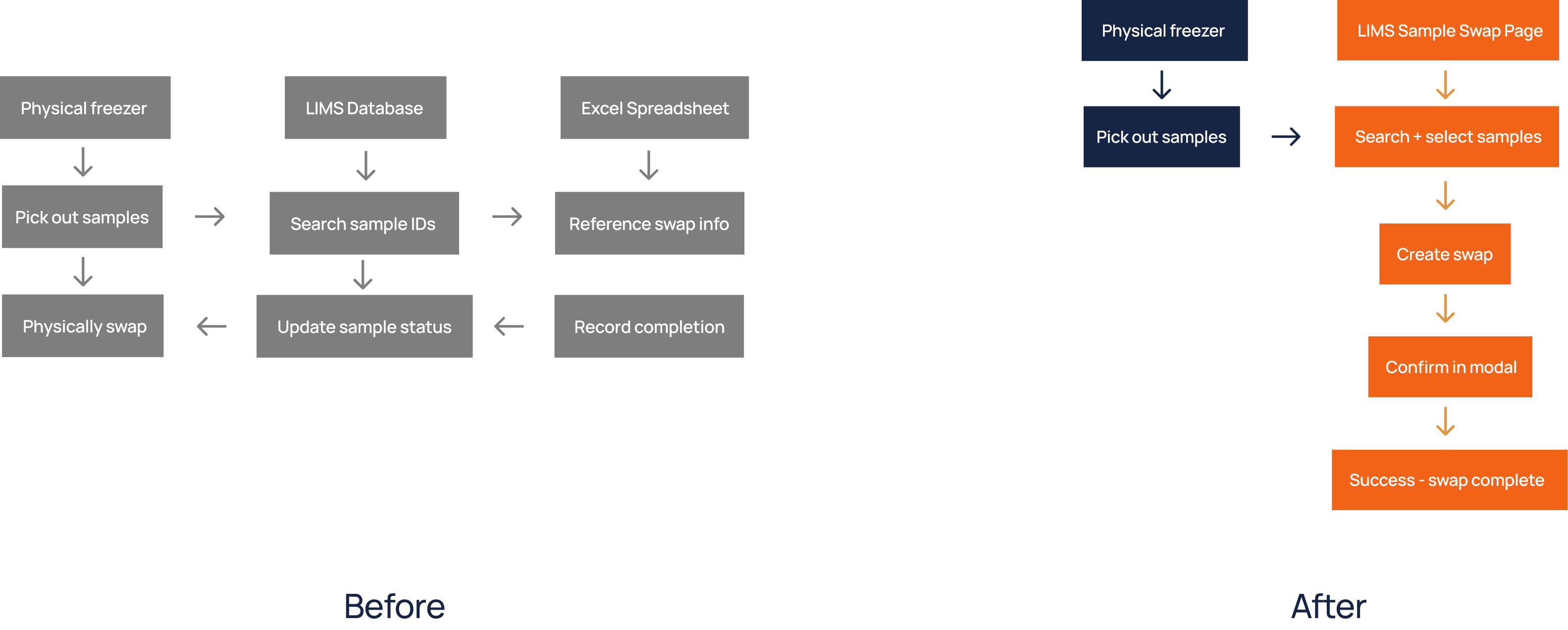
Lab scientists must regularly swap temporary samples with active samples so that old ones are discarded and whenever someone needs, they can take from a new active sample. Everyday lab scientists swap hundreds of samples and each swap alone takes approximately 2 minutes, creating significant friction for a repetitive daily workflow.
Coming from a non-scientific background, I knew I needed to deeply understand the lab workflow before proposing solutions. I took the initiative to shadow scientists in the lab, wearing a lab coat and gloves as I followed the entire sample swap process, from retrieving samples in the freezer to updating records in LIMS and utilizing spreadsheets. Experiencing the workflow firsthand gave me a much deeper understanding of their day-to-day challenges than I could have gained from meetings alone. Throughout the process, I asked questions, validated my understanding with lab staff, and challenged my own assumptions before moving into visuals.
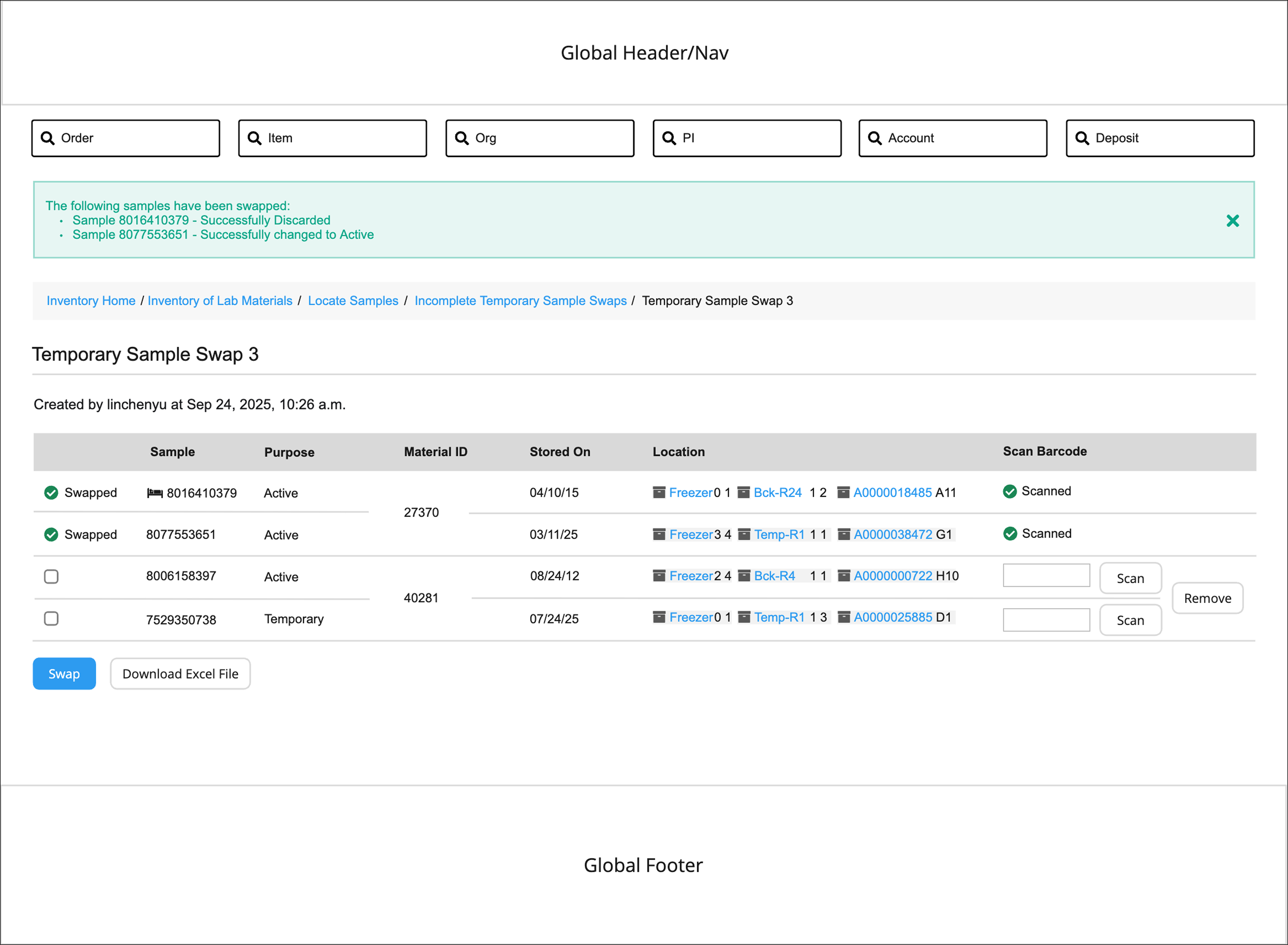
For the new process of swapping samples, at first I imagined a new modal popping up to prompt a user. But, it was limited in information and interaction real estate and after discussing with the product manager, we concluded an entire new page would be better.
I started with a very basic wireframe layout and then made a more polished wireframe using existing design components and patterns from LIMS.
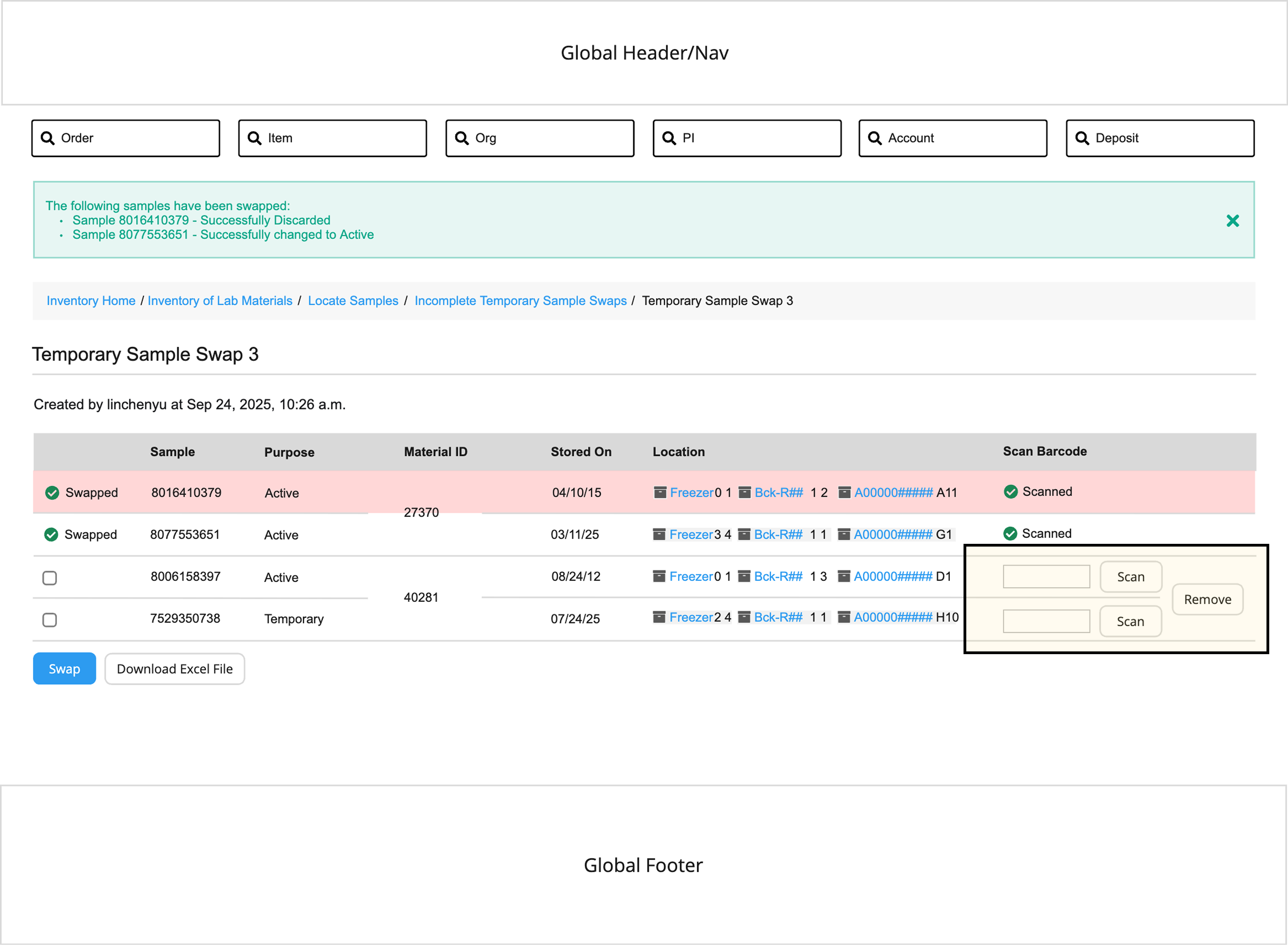
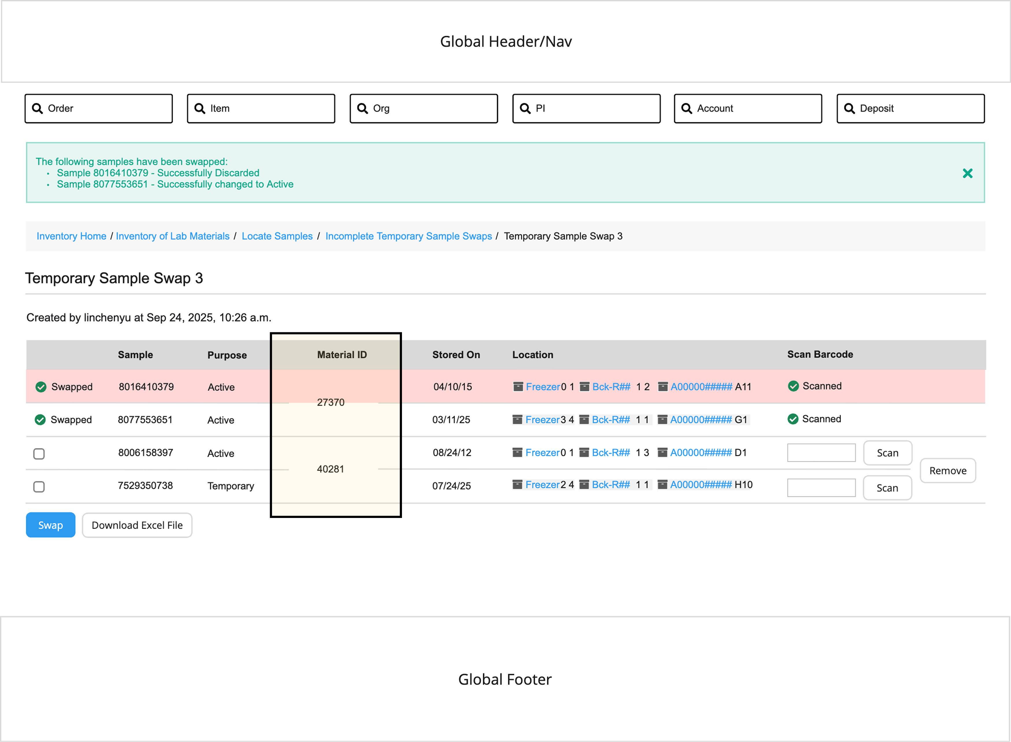
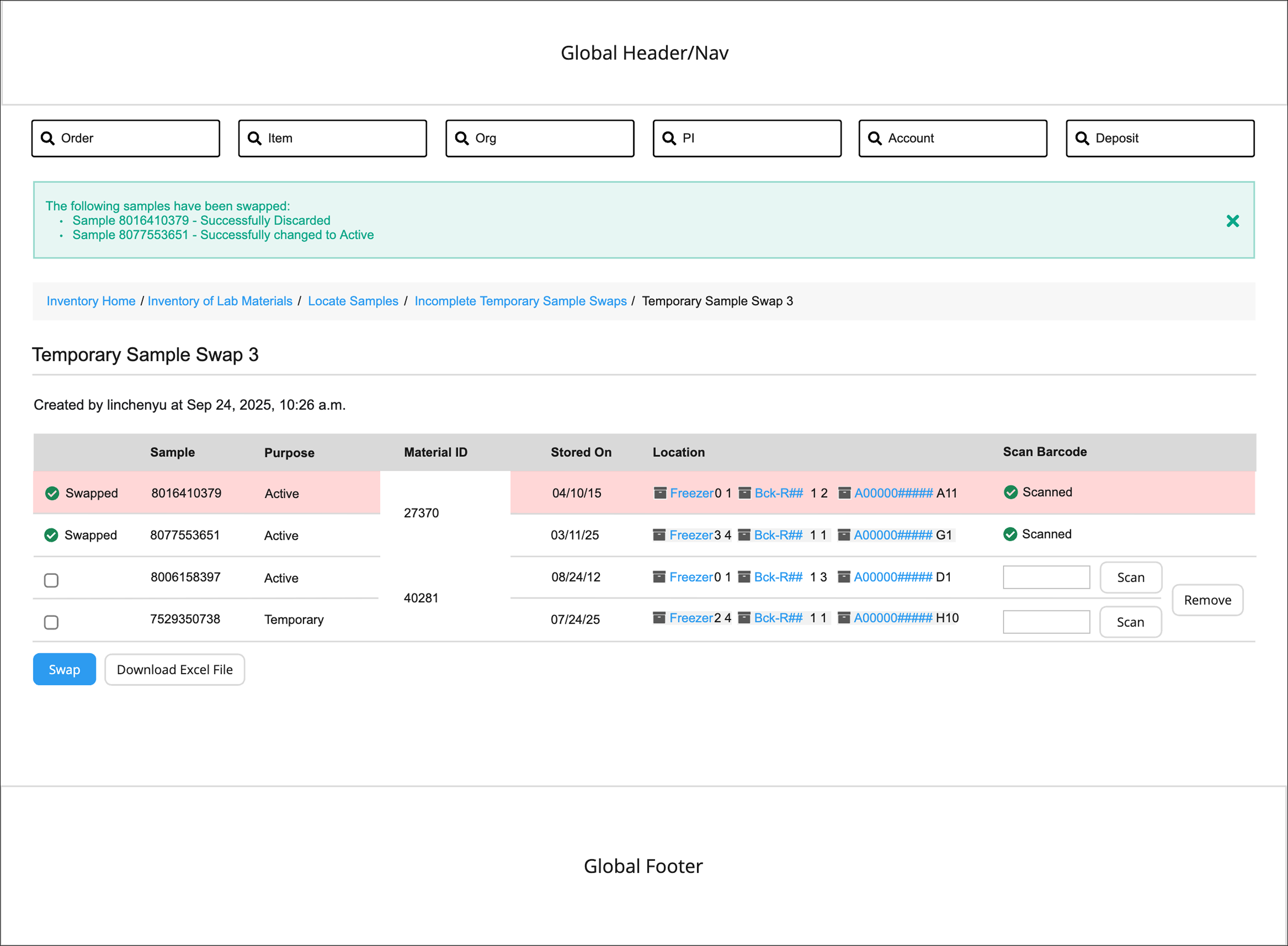
Users need to know that an Active sample and Temporary sample will always be paired, thus, all actions should apply to them both. Sample pairs would always have the same Material ID and if one gets removed, the other should respectively.
This led me to combine the rows at the end so the Remove button applies to both samples in a pair.
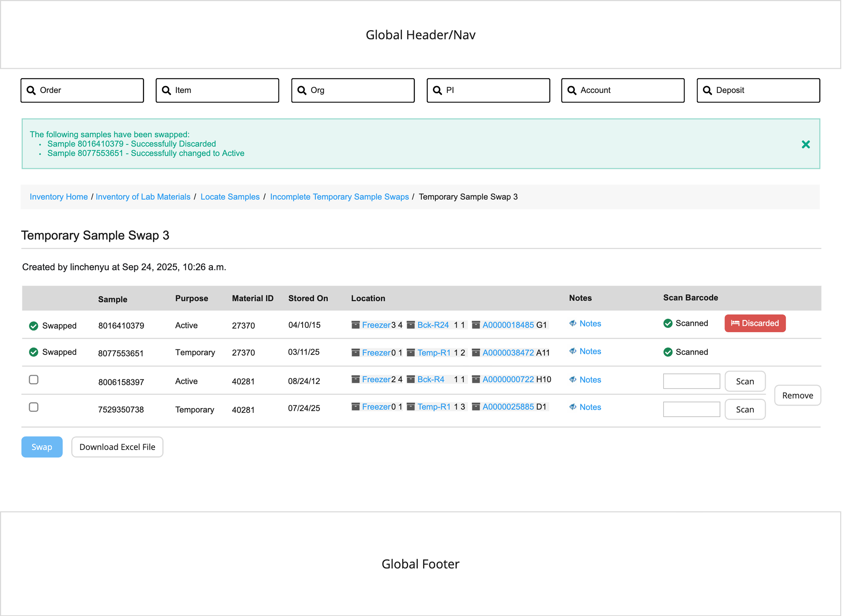
The current existing pattern in LIMS to show a discarded sample as a red background. A red background for many rows gives the table an almost "candy cane" look which is not very readable or accessible.
Moreover, now that I'm using row span to show the two samples are together (combining the rows for the Material ID), the red background pattern becomes an issue because it visually cuts through half the number!
I tried a few options to present to the Product Manager, using a combination of colored backgrounds, row spans, and an icon to show both a discarded sample and what samples are paired.
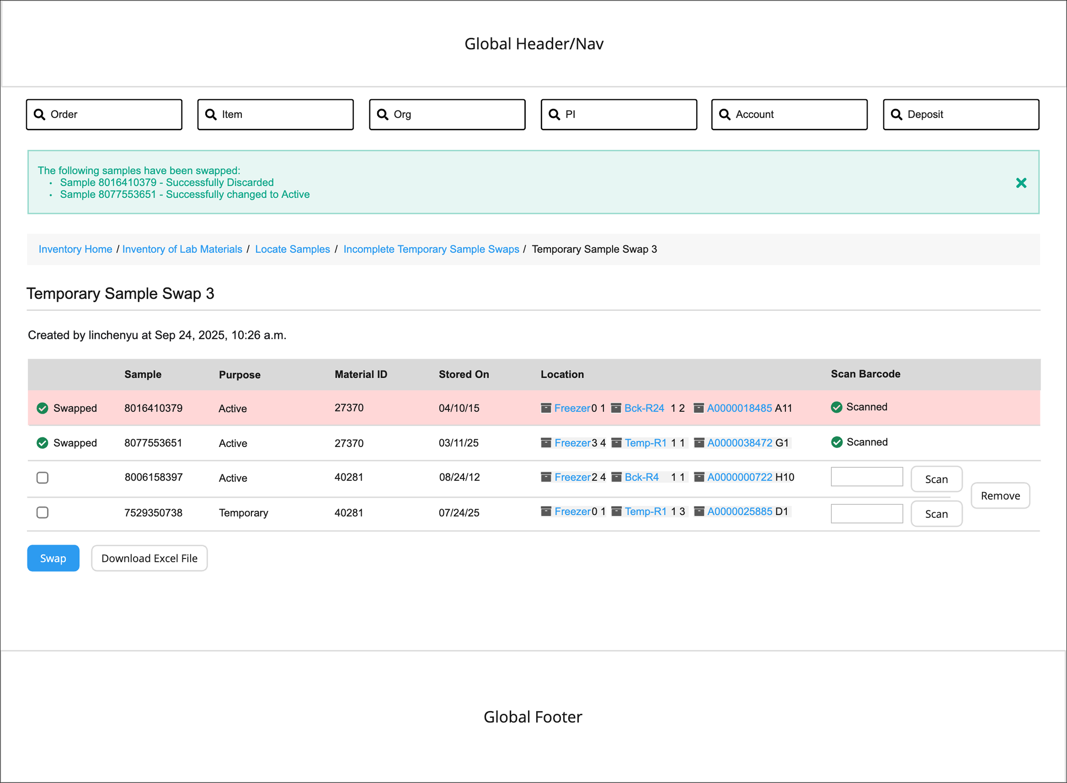
I ended up using none of those 3 options! And went into the direction of a red badge which combined a lot of the best parts of the ideas above while keeping it accessible. That way, both color (red) and an icon would be used.
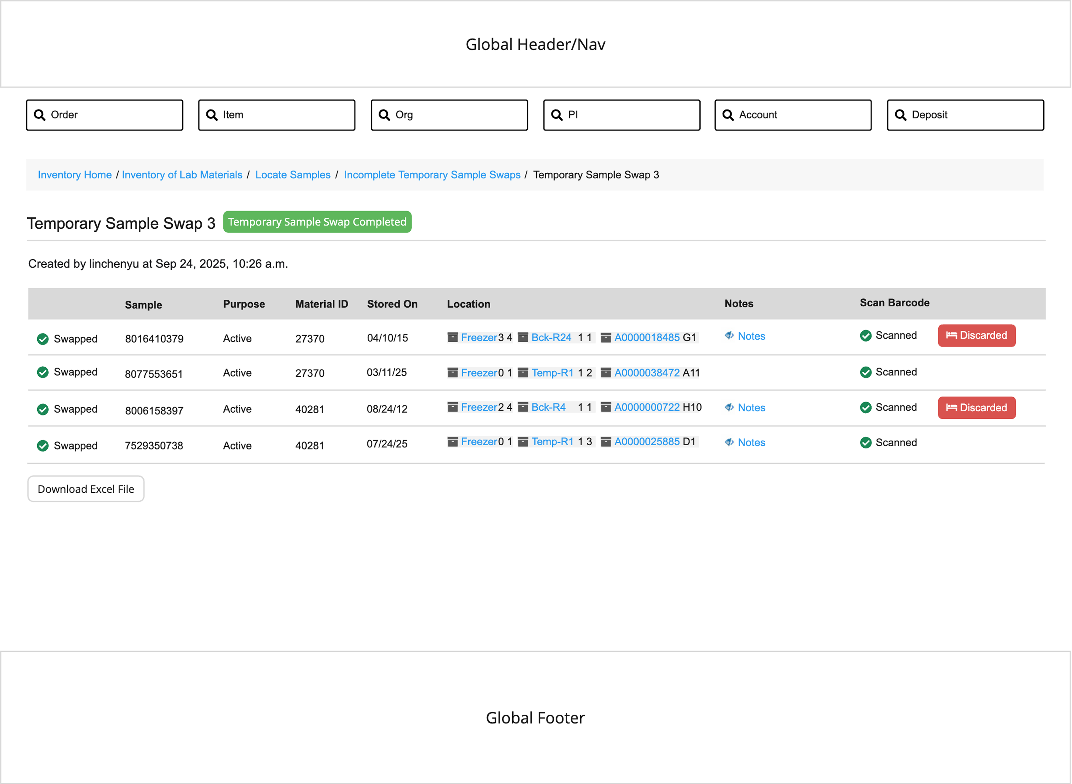
A user can access a LIMS Sample Swap page that's been completed for a limited time via its URL or from a new Sample Swaps Admin page. A new periodic task will run monthly to delete Sample Swaps that have been completed in the past 30 days to reduce clutter.
This allows users to easily review and confirm recent Sample Swaps, reducing errors and improving confidence and efficiency in their workflows!
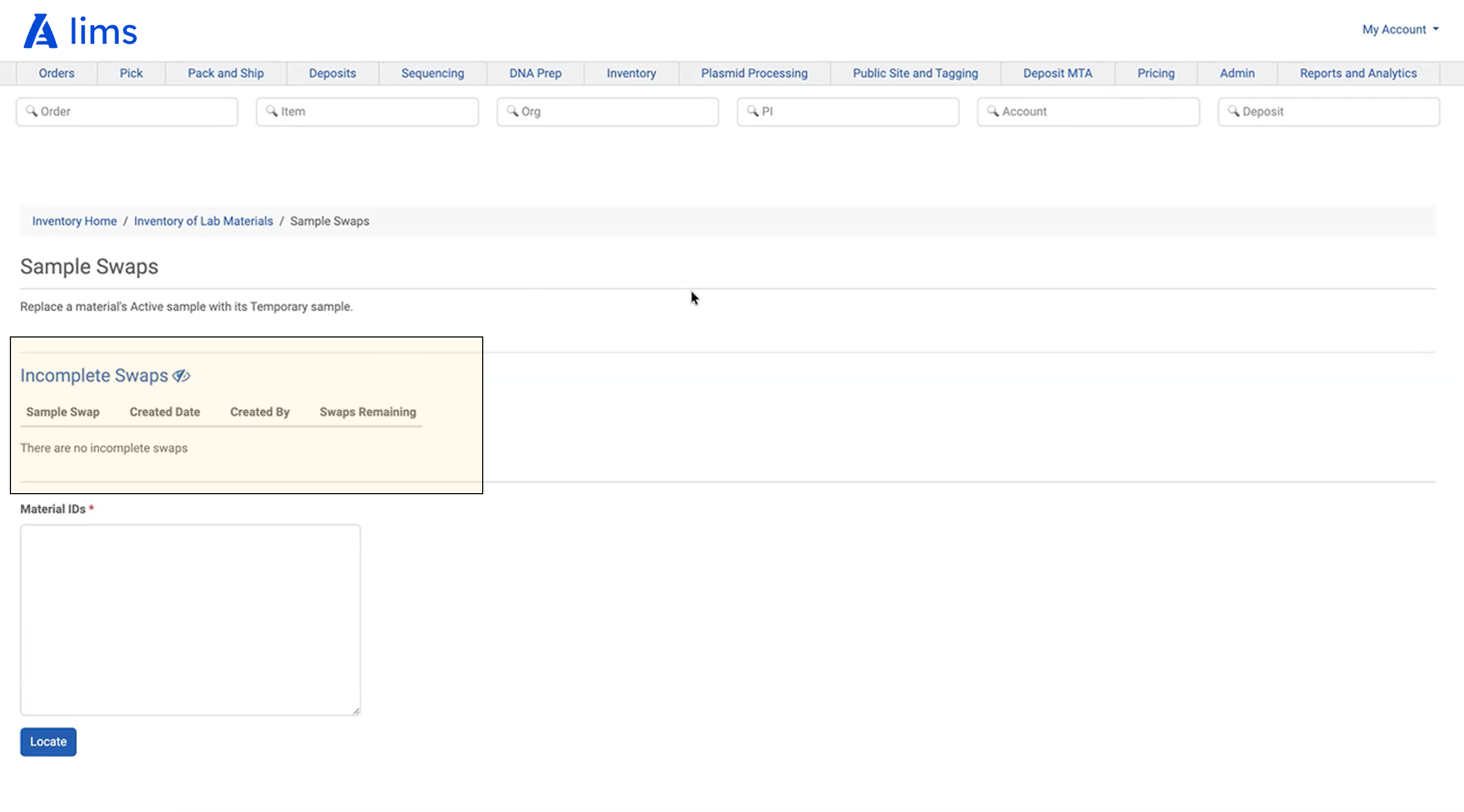
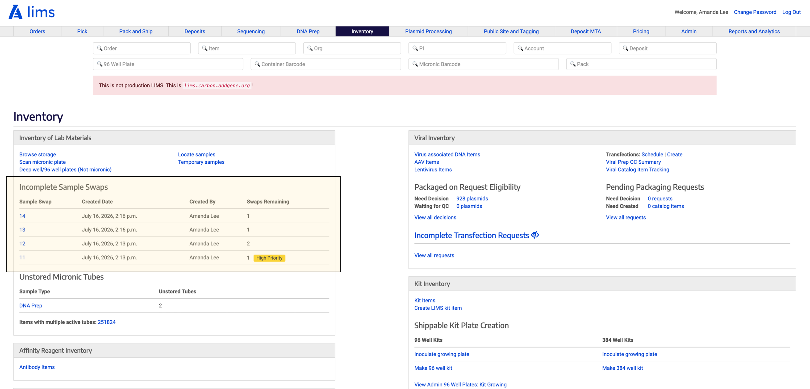
During staging review, engineering had already implemented the Incomplete Swaps section on the original page as planned. While reviewing the live experience, I noticed that as the list of incomplete swaps grew, it continuously pushed the search interface farther down the page, disrupting a task users performed repeatedly. Although the implementation was technically correct, I advocated for relocating the feature to a dedicated page where it better aligned with users' workflows. By explaining the UX implications and collaborating with engineering, we successfully pivoted and updated the experience before launch.
This process now only takes approximately 30 seconds (in comparison to the previous 2 minutes!)
In the original design on the mainsite, scientists must navigate an outdated design flow. Many of the visual design elements like buttons were inconsistent. But, the largest problem was the way the information was currently all displayed, making it hard to distinguish what a user should complete first, second, and last.


I landed on my final design based by combining the areas from each exploration I liked! This final design also was technically feasible and built off existing design patterns we had.
On the mainsite, there are several browse pages (such as Browse Plasmids) that are meant to help make searching quicker and more approachable. But the unorganized structure of the current pattern makes little sense, making navigation difficult.
I wanted to modernize the page to feel more aligned with current design standards while making it concise and easy to navigate. One method to do this was checking in with the content team to find out what information was absolutely necessary and what could be cut out.
I also wanted to make a well designed template with repeatable patterns so all the following browsing pages can follow!

- Hard to scan
- Not visually engaging
I explored different layouts keeping in mind composition, readability, and scalability (using the same template for future pages like this one).

After receiving feedback, I narrowed it down to these 3 directions and the final design eventually came down to 1. Vertical List of Links (treated as buttons) which were stylized in a new way but uses existing components like link text size, color etc. This pattern would also be used on other parts of the consumer facing site.

The hover states for these buttons needed to be differentiable enough from the default state and pass AAA accessibility guidelines. This led to 1. blue stroke, white background, and blue text style.


